
ICAI unveils New CA Logo at GloPAC Conference
In the Global Professional Accountants Convention (GloPAC), the Institute of Chartered Accountants of India (ICAI) revealed a new logo for Chartered Accountants (CAs). The symbol represents the accounting profession’s commitment to becoming a nation-building partner.
The Institute tweeted on ‘X’,
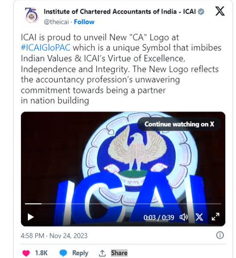
Click Now: https://x.com/theicai/status/1728012794245906869?s=20
In 2022, the ICAI successfully organized the 21st World Congress of Accountants. Building on this success, the ICAI is currently launching its inaugural “Global Professional Accountants Convention” (GloPAC), with the intention of producing similar-sized gatherings in the future. The purpose is to unite the global accounting community and keep them informed of the world’s ever-changing dynamics.
GloPAC attempts to bring key players from around the world together, such as thought leaders, policymakers, standard setters, industry and commerce groups, and financial institutions. The major purpose is to hold meaningful conversations and debates regarding current accounting difficulties and future advancements. GloPAC, positioned as a ‘Window to the Future,’ offers comprehension and adaptability to previously unforeseen aspects in the global economy and regulatory landscape. This convention serves as a forum for leaders to exchange ideas and have conversations, as well as a guideline for professional accountants. The new logo is designed to bring about a significant shift in the attitude and passion of the chartered accountancy profession.
This convention serves as a place for leaders to exchange ideas and conversations, indicating a path for professional accountant development, and the new logo is expected to bring about a fresh shift in the spirit and passion of the chartered accountancy profession.
Table of Contents
Guidelines for the use of new CA logo and colour significance
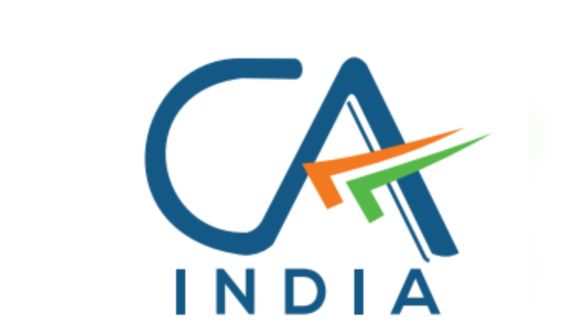
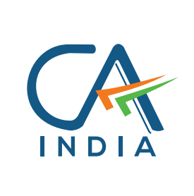
During the GloPAC Convention, the Institute of Chartered Accountants of India (ICAI) proudly unveiled its new logo, ushering in a new era for the prestigious accounting profession. This eye-catching design complements the colors of the Indian national flag well. This unique design not only honors the country’s rich heritage, but it also symbolizes the symbiotic relationship between the prestigious accounting profession and the spirit of India. More than just a cosmetic alteration, the new logo is a powerful reflection of the fundamental values that have characterized the ICAI and the accounting profession throughout their long history.
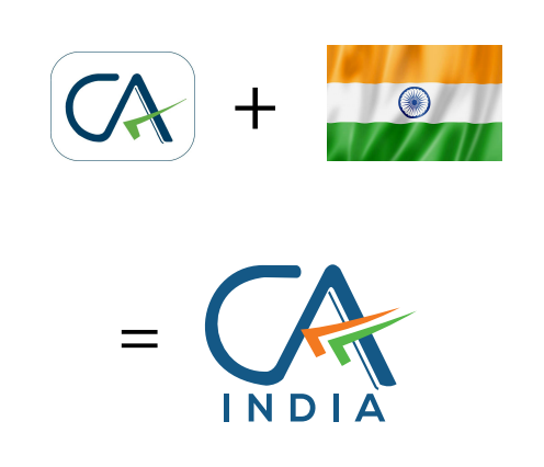
Incorporation of Tricolor
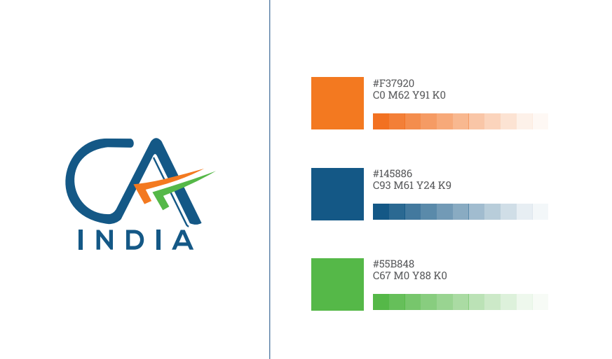
The tricolor in the logo is an eye-catching representation of the Institute’s ties to India. The three colors of the Indian flag represent unity, diversity, and sovereignty, and they reflect the brand’s commitment to serving Indians and contributing to the country’s progress. The tricolor has been used in a way that indicates velocity, flight, and progress, emphasizing the Institute’s forward-thinking mindset.

Significance of blue color
The predominant color of the new logo is blue, which was inspired by the ICAI logo. Blue is a hue linked with divinity, immortality, bravery, and determination. It reflects immensity, being the color of the sky and ocean, and has long been a part of the Indian cultural, political, and social environment. Blue is also culturally significant, having been a part of Indian tradition for almost 5,000 years

Adaptability on all platforms
The new logo is compatible with all platforms, both digital and analog, which is essential for a modern brand. This versatility ensures that the Institute’s brand remains consistent across all media, enhancing the Institute’s identity and credibility. The versatility of the new logo also makes it more accessible to the Institute’s stakeholders, who include members, students, and the general public.
In a nutshell
CA India’s new logo reflects the brand’s relationship to India while maintaining its existing identity. The new logo incorporates the tricolor, emphasizes the relevance of the blue color, and is adaptable across all platforms. The design is intended to be both aesthetically beautiful and culturally meaningful, representing the Institute’s principles and commitment to helping the people of India.
Guidelines (2023) for using the new CA India logo for CA members
The logo consists of the letters ‘CA’ in blue on a white background, with an upside-down multicolored tick mark. Blue denotes not simply contrast against any background, but also originality, innovation, knowledge, integrity, trust, truth, stability, and depth. The upside-down tick mark, which Chartered Accountants usually use, has been included to signify the professional’s wisdom and value.
The term ‘India’ is also featured in the design to highlight the Institute’s connection to the India First approach and commitment to serve the Indian economy for the greater good.
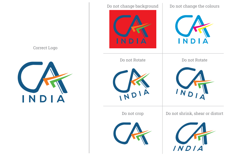
– The font should not be changed (color, bold/unbold, size). Furthermore, the spacing and size should not vary.
– The color scheme is :

– Do not alter the design or colors, including the white backdrop.
– Do not rotate or tilt the logo clockwise or counterclockwise.
– The logo should not be reduced or altered in any way that changes its original proportion.
– While members are encouraged to use the new CA India Logo on letterheads, visiting cards, and the website, a one-year transition period has been provided for members to use existing stationary/signage replacement, etc.
*Effective from 24th November, 2023.
Also Explore More : https://amitbachhawat.com/
FAQ’s
Nischal Narayanam, a Hyderabad-born child prodigy, is the country’s youngest chartered accountant.
R Sivabhogam (Ramasamy), who was born in India on July 23, 1907, was the country’s first female chartered accountant.
The man recognized as founding the accounting profession in India is Shri Kalyan Subramani Aiyar (1859–1940).